13 / 14
StorSafe
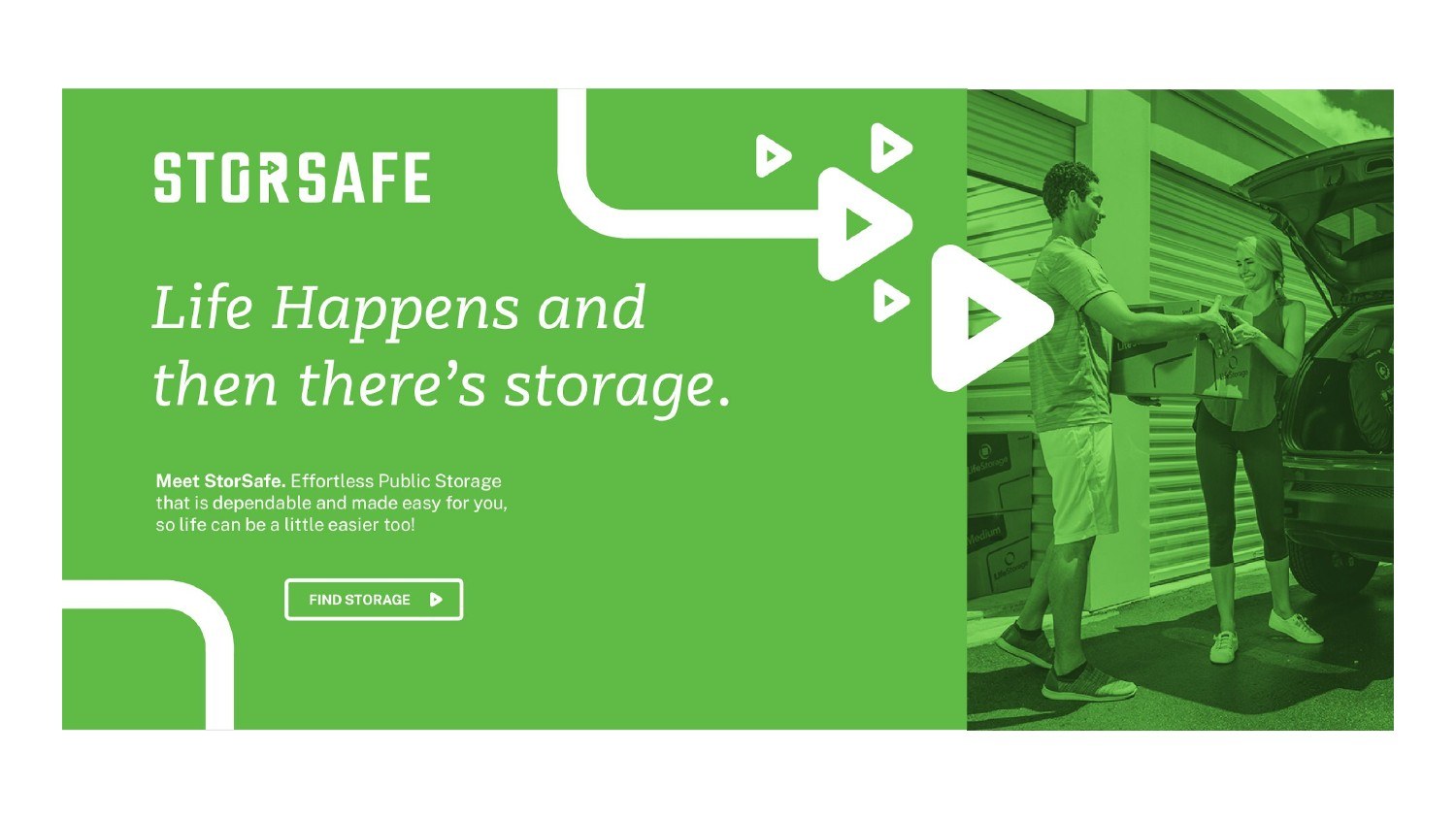
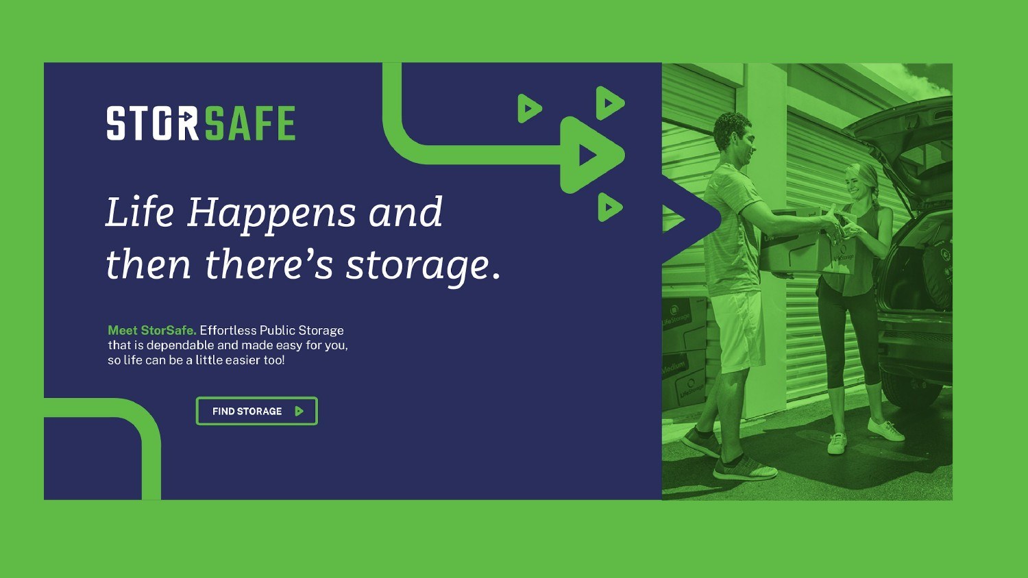
Life happens, and then there's storage. Brand for a tech-forward storage company.
The challenge
StorSafe is a self-storage company with big growth plans that wanted to look like a public company from day one. Most of their customers are women who care about privacy, cleanliness and well-lit, safe spaces, and the brand needed to stand out from competitors with a clean, high-tech feel rather than literal storage imagery.
The approach
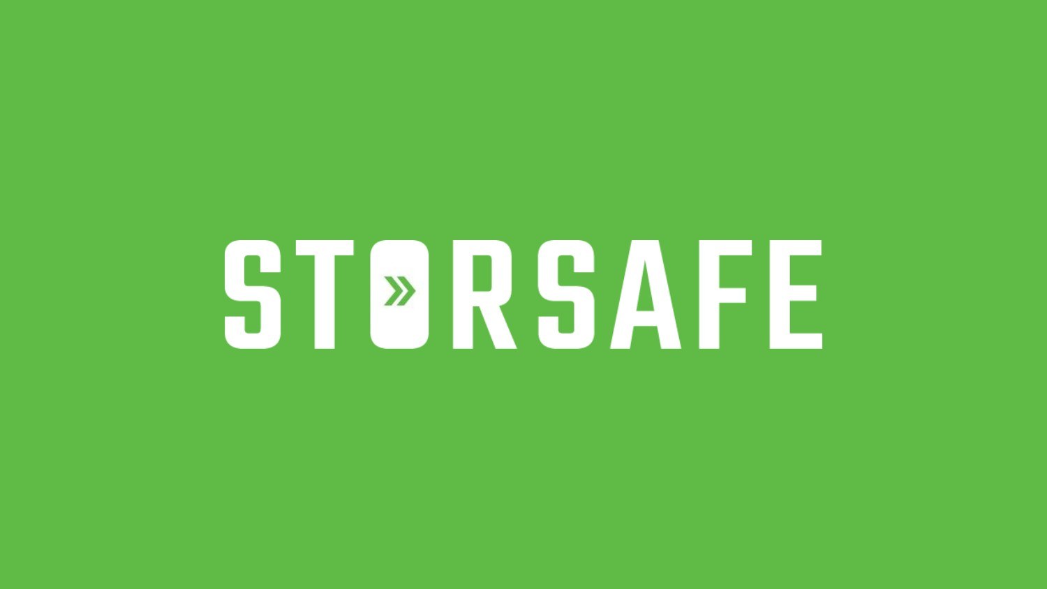
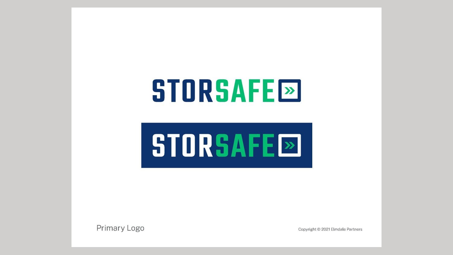
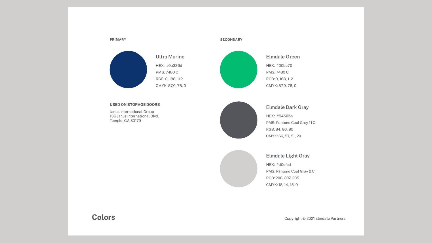
I explored three directions: Life's Moments, Life in Action and Life Contained. Life in Action won because it felt tech-forward without being too techie, using a fast-forward symbol inside the 'O' that gives a 'press here' feel and a yellow-green electronic palette. I refined the wordmark and color variations and delivered a brand guide.
Delivered
- Logo and wordmark
- Tagline: 'Life happens and then there's storage.'
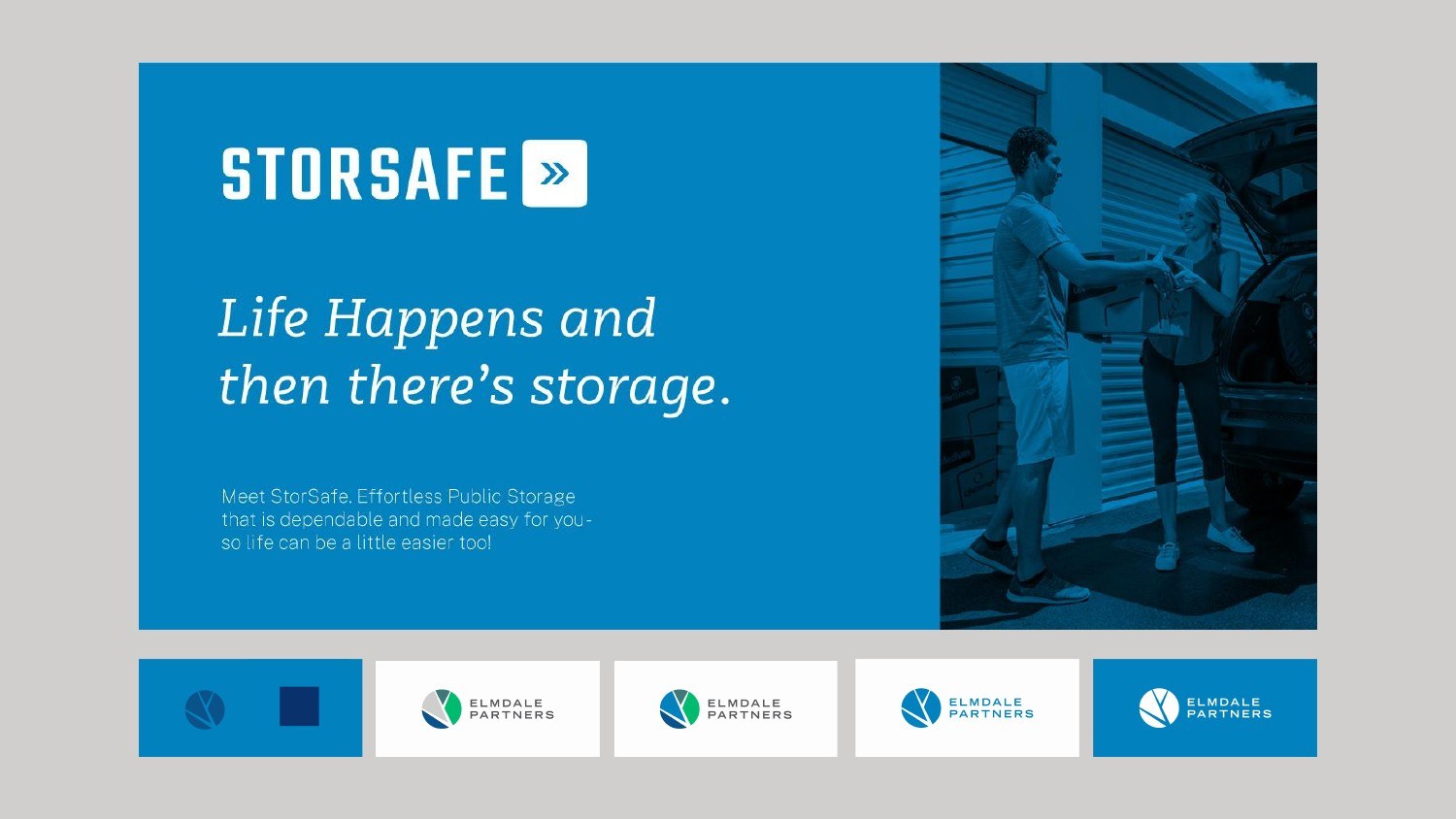
- Color palette and variations
- Typography and imagery guidelines
- Brand guidelines document